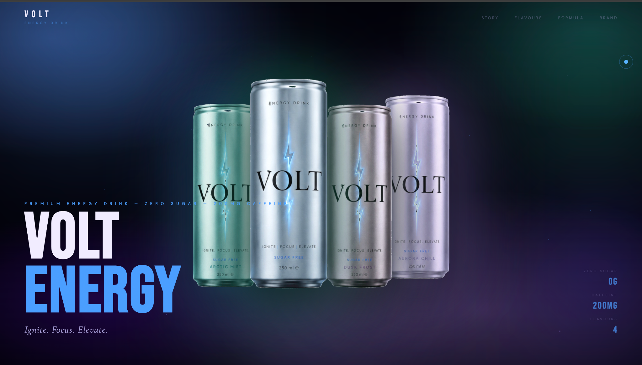
VOLT is a self-initiated energy drink brand built on one idea: performance can feel premium without becoming visually noisy. The identity carries from the physical cans into a responsive website, using clear hierarchy, four distinct flavor worlds, and transparent product information. Ignite. Focus. Elevate.
The strategy started with a simple question: how can an energy brand deliver functional performance while also feeling clearer, more premium, and easier to trust? Research on young-adult energy-drink consumers showed that performance gets attention, but choice is multidimensional. Price, label appeal, calories, taste and caffeine all play a role, and front-of-package nutrition information influences purchases for most U.S. consumers at least some of the time.
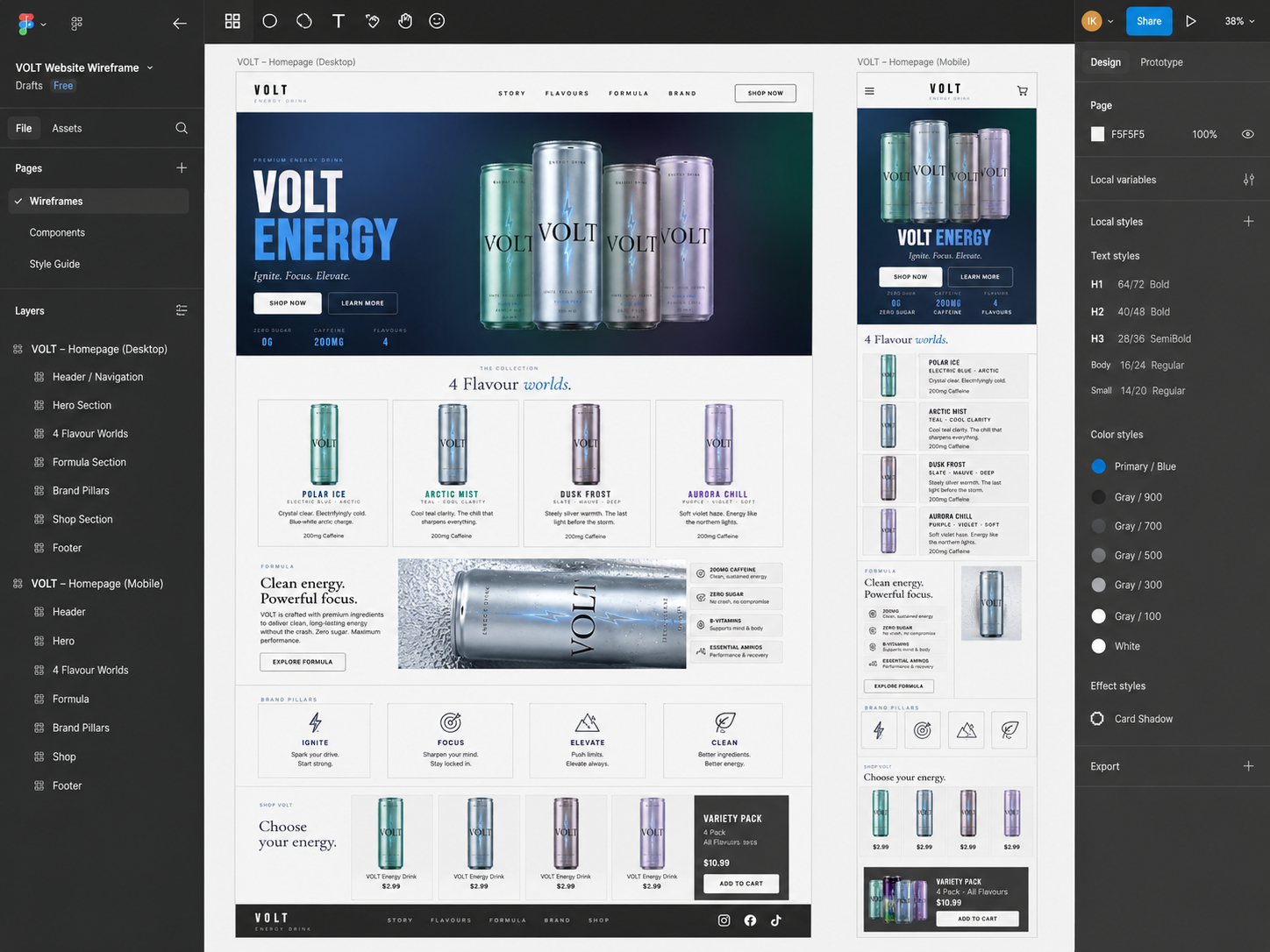
The site was planned in Figma as a complete desktop and mobile structure, using the real image hierarchy, product cards and components rather than empty placeholder boxes, then built as the live experience. The order is intentional: establish the brand first, then give visitors progressively more detail.
Project Breakdown
Brief
Design a premium energy drink brand and website that carries one system from the can to the screen: high performance without visual or informational noise.
Audience
Young-adult energy-drink consumers who want performance but also value taste, transparency and lower-sugar cues.
Landscape
A crowded category of established brands (Monster, Reign, GHOST, CELSIUS, Red Bull and Alani Nu), pulled between performance-led functionality and identity-driven lifestyle. VOLT sits between the two: premium and identity-driven, with clearer product information and lower-sugar messaging. This is a qualitative audit, not a market score.
Big Idea
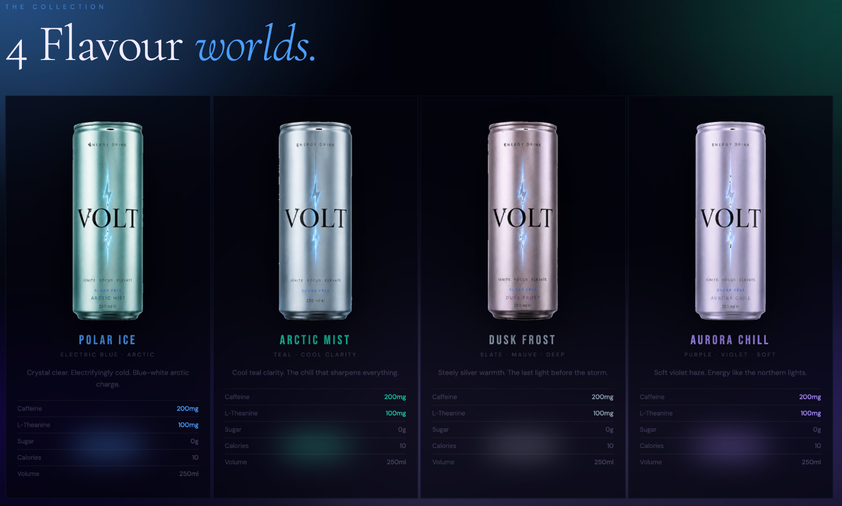
“Ignite. Focus. Elevate.” Performance communicated plainly: 200mg caffeine, zero sugar and 10 calories, stated up front instead of buried.
System
Metallic cans, atmospheric color and a restrained layout. Four flavor worlds (Polar Ice, Arctic Mist, Dusk Frost and Aurora Chill) each get their own color while the hierarchy stays fixed.
Experience
One hierarchy, re-composed for each screen: Hero, Story, Flavours, Formula, Brand, Shop. Large imagery leads on desktop; cards tighten and stack on tablet and mobile instead of shrinking type.
Outcome
A cohesive brand and live website where identity, packaging and responsive interface work as one system.